Brand Guide
This page is the single source of truth for the Symmitri visual identity. Use these standards across all digital and print materials to ensure consistency and quality.
01 / Color Palette
Colors
Purple
Primary
rgb(184, 128, 255)
Hyper Green
Accent
rgb(204, 253, 191)
Orange
Accent
rgb(235, 93, 65)
Carbon
Surface
rgb(45, 45, 43)
Almost Black
Background
rgb(16, 16, 16)
White
Text / Inverse
rgb(255, 255, 255)
Recommended Combinations
02 / Typography
Type System
Display / Headlines
The work gets done.
Hedvig Letters Serif
Body / UI
The work gets done.
SF Pro Display / System Sans
Mono / Code
The work gets done.
Space Mono
Type Scale
Your AI Chief of Staff
The work gets done. You're not doing it.
Deploy intelligence, not headcount
Autonomous execution across every channel
Email, calendar, Slack, and iMessage
Features & Capabilities
Symmitri deploys an AI Chief of Staff that joins your email, calendar, Slack, and iMessage. It handles the coordination, follow-ups, and operational work that used to require a full-time hire.
We believe founders should spend their time on vision and relationships, not coordination overhead. Symmitri acts autonomously within the boundaries you set, learning your preferences and communication style over time.
All actions are logged and auditable. You maintain full control over permissions, tone, and decision boundaries at all times.
Last updated March 2026. All assets are subject to brand approval.
const agent = await symmitri.deploy({ role: "chief-of-staff" });03 / Logo System
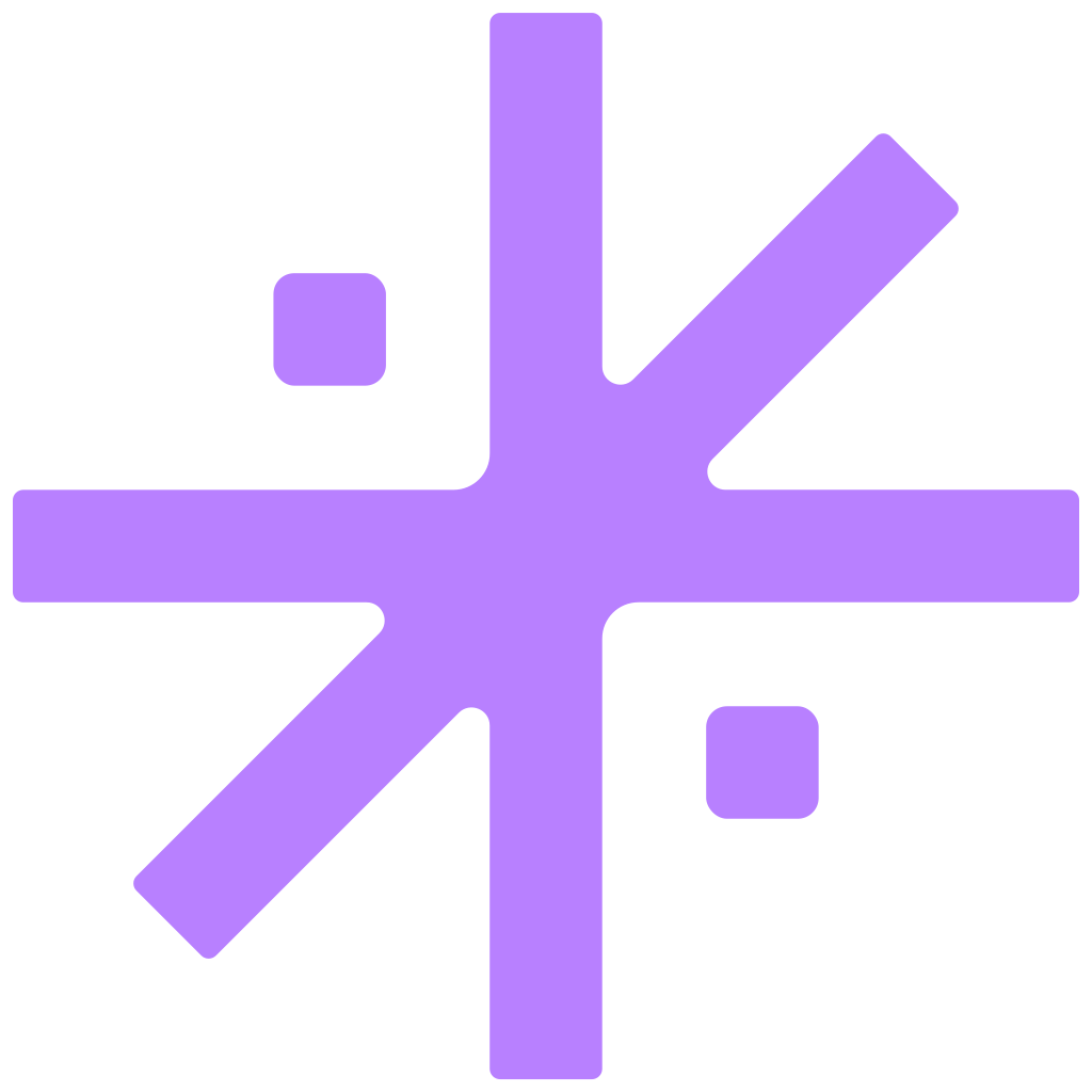
Logo Variants
The logo system has three components: the logomark (asterisk icon), the logotype/wordmark (the “symmitri” text), and the lockup (logomark + wordmark together). Each exists in multiple color variants.
Logomark


Logotype (Wordmark)
 Purple
 White
White Black
BlackLockup (Logomark + Wordmark)
 All Purple
 White + Purple Mark
 All White
 Black + Purple Mark
 All Black
Secondary Logomark (App Icon)
The secondary logomark places the asterisk inside a rounded square. Use this for app icons, Slack/Google profile images, and social media avatars.
 Purple / White
 White / Purple
 Black / Purple
 Purple / Black
04 / Spacing & Usage Guidelines
Usage Rules
Clear Space
Maintain a minimum clear space equal to the height of the small square element in the logomark on all sides. This ensures the mark reads cleanly in any context.
Minimum Sizes
The logomark should never be rendered smaller than 24px in digital contexts or 10mm in print. At smaller sizes, details become illegible.
✓Do
- Use approved color combinations only
- Maintain clear space around the logomark
- Use Hedvig Letters Serif for all headlines
- Lowercase "symmitri" in body text and wordmarks
- Capitalize "Symmitri" at the start of sentences
✕Don't
- Rotate, stretch, or distort the logomark
- Place on busy or photographic backgrounds
- Use unapproved color combinations
- Add effects like drop shadows or gradients to the mark
- Write as "SYMMITRI", "Symmitri™", or "SymmiTri"
05 / Downloads
Brand Assets
06 / Gradients
Gradient Brand Assets
Four animated gradient palettes for use across digital, video, and presentation assets. Each gradient can be configured, exported as WebM or PNG, and embedded directly via HTML.
07 / Graphics & Icons
Animated Brand Assets
Geometric icon graphics using the brand color palette. Each supports dark and light background modes and can be exported as WebM or PNG.